Style Sheets
Enaml style sheets are a powerful feature which allow the developer to customize the visual appearance of a view independent from the view’s structural definition. The concepts and nomenclature used in Enaml style sheets are heavily based on CSS and WPF, but are adapted to the dynamic and declarative world of Enaml.
Overview
Cascading Style Sheets is a well known technology for specificing the look and feel of documents written in XML markup, and is most commonly used to style HTML web pages. The primary design goal of CSS is to separate document content from document presentation, resulting in more scalable, flexible, and maintainable code.
WPF Styling shares the same documents separation goals as CSS, but is implemented using the same markup language as the document structure. WPF styles also include development features which are not present in CSS (such as data-driven style striggers), but which are immensely useful in desktop application development.
Enaml style sheets combine the successful concepts from both CSS and WPF. Style sheets:
- use selectors to match style rules to widgets
- cascade across the object hierarchy of the view
- are written with the same language as the rest of view
- are fully dynamic and data-driven
There are three classes involved in creating a style sheet: StyleSheet, Style, and Setter. The developer arranges these classes into a hiearchy declared on a Stylable widget in order to apply the styling to that widget hierarchy. The following simple example shows how to set the text color of all PushButton widgets in a Window to blue:
from enaml.widgets.api import (
    Window, Container, PushButton
)
from enaml.styling import (
    StyleSheet, Style, Setter
)

enamldef Main(Window):
    title = 'Style Sheet'
    StyleSheet:
        Style:
            element = 'PushButton'
            Setter:
                field = 'color'
                value = 'blue'
    Container:
        PushButton:
            text = 'First'
        PushButton:
            text = 'Second'
        PushButton:
            text = 'Third'
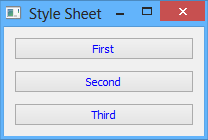
The StyleSheet class forms the root of the hierarchy for a style sheet. Its sole purpose is to provide an aggregation point for the Style objects defined for the style sheet.
The Style class serves the role of the selector in typical CSS parlance. It also serves as an aggregation point for the style Setter objects. The various attributes of the style combine to form a rule against which all the widgets for the style sheet are tested. If a widget is a match for the rule, then the style setters are applied to that widget. The order in which multiple matching styles are applied is governed by the rules of Selectors, Specificity, and Cascading.
The Setter class provides the information needed to style a single aspect of an object in the form of field and value attributes. Both attributes accept strings values and represent the field name and value to apply to a widget’s style. A setter is declared as a child of a Style object and is applied to any widget which matches the style rule. Multiple setters may be defined on a single style, and they are applied in the order in which they are declared.
See the List of Fields reference section for the list of supported style field names.
Selectors
A style sheet consists of a list of Style objects, each having a list of Setter objects which will be applied to any Stylable widgets which match the style’s selector.
The style selector is made up of three attributes on the Style object:
- element - This is a string which will match the name of the type of the stylable object or any of its subtypes. For example, "Field" will match all instances of Field or any of its subtypes. An empty string will match all types. Multiple types can be specified by separating them with a comma, which will match using logical OR semantics.
- style_class - This is a string which will match the style_class attribute on a stylable object. This is very similar to the concept of CSS classes. An empty string will match all style classes. Multiple style classes can be specified by separating them with a comma, which will match using logical OR semantics.
- object_name - This is a string which match the name attribute on a stylable object. This is very similar to the concept of CSS identifiers. An empty string will match all object names. Multiple object names can be specified by separating them with a comma, which will match using logical OR semantics.
All three selector must be a match for a given widget for the style to be considered a match. See the section on Specificity for details on how the strength of the match is computed.
Note
The style_class attribute on a Stylable object can be assigned a space-separated string, which indicates that the object belongs to more than one style class. Combined with the comma-separated style selectors, this provides a very powerful mechanism for targeted selection.
Unlike CSS and WPF, Enaml style sheets do not provide selectors which match based on object attribute values. Developers should instead use Enaml’s dynamic operators to update the style class of an object at runtime. The styling engine is optimized for this mode of operation.
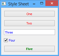
The following simple example shows each of the selectors in use:
from enaml.widgets.api import (
    Window, Container, PushButton, Field,
    CheckBox
)
from enaml.styling import (
    StyleSheet, Style, Setter
)

enamldef Main(Window):
    title = 'Style Sheet'
    StyleSheet:
        Style:
            element = 'PushButton'
            Setter:
                field = 'color'
                value = 'red'
        Style:
            style_class = 'blue-class'
            Setter:
                field = 'color'
                value = 'blue'
        Style:
            object_name = 'special'
            Setter:
                field = 'color'
                value = 'green'
            Setter:
                field = 'font-weight'
                value = 'bold'
    Container:
        PushButton:
            text = 'One'
        PushButton:
            text = 'Two'
        Field:
            style_class = 'blue-class'
            text = 'Three'
        CheckBox:
            style_class = 'blue-class'
            text = 'Four'
            checked = True
        PushButton:
            text = 'Five'
            name = 'special'
Specificity
The nature of style selectors is such that a single style can be matched to multiple widgets, and a widget can be matched to multiple styles. This is the main feature which makes style sheets so powerful and expressive! However, this flexibility presents the possibility for conflicts in a widget’s style specification. What to do if a widget matches multiple styles, all of which have a setter which defines a value for the color field? These sorts of conflicts are resolved by examining the specificity of a selector match.
A selector’s specificity is nothing more than an integer which indicates how strongly a given widget is a match for the style. It is computed according to the following formula:
- Start with a specificty of 0.
- Add 1 if the element selector matches the item.
- Add 16 for every style_class which matches the item.
- Add 256 if the object_name selector matches the item.
- The final value is the specificity of the match.
When the styling engine is computing the style to apply to a widget for a given style sheet, it computes the specificity for all matching styles and then sorts them according to that specificity. Ties are broken by the order in which the styles were declared. The styles are then applied in order from least-specific to most-specific.
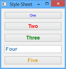
The following simple example demonstrates specificity:
from enaml.widgets.api import (
    Window, Container, PushButton, Field
)
from enaml.styling import (
    StyleSheet, Style, Setter
)

enamldef Main(Window):
    title = 'Style Sheet'
    StyleSheet:
        Style:
            element = 'PushButton'
            Setter:
                field = 'color'
                value = 'blue'
        Style:
            element = 'PushButton'
            style_class = 'alpha'
            Setter:
                field = 'color'
                value = 'red'
        Style:
            element = 'PushButton'
            style_class = 'beta'
            Setter:
                field = 'color'
                value = 'green'
        Style:
            style_class = 'alpha, beta'
            Setter:
                field = 'color'
                value = 'steelblue'
            Setter:
                field = 'font'
                value = 'bold 12pt Arial'
        Style:
            object_name = 'special'
            Setter:
                field = 'color'
                value = 'goldenrod'
    Container:
        PushButton:
            text = 'One'
        PushButton:
            text = 'Two'
            style_class = 'alpha'
        PushButton:
            text = 'Three'
            style_class = 'beta'
        Field:
            text = 'Four'
            style_class = 'alpha beta'
        PushButton:
            text = 'Five'
            style_class = 'alpha beta'
            name = 'special'
Cascading
A style sheet can be applied to the global Application and to any Stylable object. The base Widget class inherits the Stylable class, so all standard Enaml widgets support style sheets. A widgets effective style sheet is computed by merging the widget’s style sheet with all ancestor style sheets, and finally with the application stylesheet.
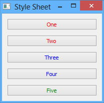
When a conflict arises between style sheets, a widget’s own style sheet takes precedence over any ancestor style sheet or the application style sheet, regardless of the specifity of the match in the conflicting sheet. This chain of stylesheets is know as the cascade, and provides a very powerful and flexible approach to styling. For example, it allows a developer to write an application-wide style sheet which covers most cases, and selectively override rules for particular widgets on a case-by-case basis.
The following simple example shows style sheet cascading in action:
from enaml.widgets.api import (
    Window, Container, PushButton
)
from enaml.styling import (
    StyleSheet, Style, Setter
)
from enaml.qt.qt_application import (
    QtApplication
)

enamldef AppSheet(StyleSheet):
    Style:
        element = 'PushButton'
        Setter:
            field = 'color'
            value = 'blue'

enamldef View(Window):
    title = 'Style Sheet'
    Container:
        Container:
            padding = 0
            StyleSheet:
                Style:
                    element = 'PushButton'
                    Setter:
                        field = 'color'
                        value = 'red'
            PushButton:
                text = 'One'
            PushButton:
                text = 'Two'
        PushButton:
            text = 'Three'
        PushButton:
            text = 'Four'
        PushButton:
            text = 'Five'
            StyleSheet:
                Style:
                    Setter:
                        field = 'color'
                        value = 'green'

def main():
    app = QtApplication()
    app.style_sheet = AppSheet()
    view = View()
    view.show()
    app.start()
Pseudo-Classes
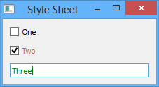
A pseudo-class augments a style selector to require that an element have a special state in order for it to be a match for the style. Usually, this state will be the result of some external user interaction and may not be reflected in the structure of the view. For example the 'hover' pseudo-class will cause an element to be a match for the style only when the user hovers over the element with the mouse.
Pseudo-classes are specified by assigning a string to the pseudo_class attribute of a Style object. Multiple pseudo-classes can be chained together with a colon, which will match using logical AND semantics. Comma separated classes are also allowed, which will match using logical OR semantics. A pseudo-class can also be negated with the exclamation operator.
See the List of Pseudo-Classes reference section for the list of supported pseudo-classes.
The following simple example demonstrates the use of pseudo-classes:
from enaml.widgets.api import (
    Window, Container, Field, CheckBox
)
from enaml.styling import (
    StyleSheet, Style, Setter
)

enamldef Main(Window):
    title = 'Style Sheet'
    StyleSheet:
        Style:
            element = 'CheckBox'
            pseudo_class = 'checked'
            Setter:
                field = 'color'
                value = 'indianred'
        Style:
            element = 'Field'
            pseudo_class = 'focus'
            Setter:
                field = 'color'
                value = 'green'
    Container:
        CheckBox:
            text = 'One'
        CheckBox:
            text = 'Two'
        Field:
            text = 'Three'
Pseudo-Elements
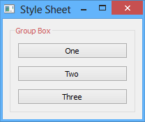
A pseudo-element is similar to a pseudo-class, but instead of specifying a special state, it is used to specify a subcontrol of a complex control. For example, the 'title' pseudo-element can be used to style the title text of a GroupBox widget.
Pseudo-elements are specified by assigning a string to the pseudo_element attribute of a Style object. Multiple pseudo- elements can be specified by separating them with a comma, which will match using logical OR semantics.
See the List of Pseudo-Elements reference section for the list of supported pseudo-elements.
The following simple example demonstrates the use of pseudo-elements:
from enaml.widgets.api import (
    Window, Container, GroupBox, PushButton
)
from enaml.styling import (
    StyleSheet, Style, Setter
)

enamldef Main(Window):
    title = 'Style Sheet'
    StyleSheet:
        Style:
            element = 'GroupBox'
            pseudo_element = 'title'
            Setter:
                field = 'color'
                value = 'indianred'
    Container:
        GroupBox:
            title = 'Group Box'
            PushButton:
                text = 'One'
            PushButton:
                text = 'Two'
            PushButton:
                text = 'Three'
Dynamism
As the examples in this article have shown, all of the classes which are used to define an Enaml style sheet are declarative; just like the standard Enaml widget classes. This means that all of Enaml’s language and framework features, such as subscription operators, templates, Include, Looper, etc. work with style sheets in the same way that they work with widgets. This gives the developer virtually unlimited flexibility in defining the styling for an application.
Inheritance
In typical CSS, fields like font and color, unless specified, will be inherited from a parent element. Other fields can be forcibly inherited with the inherit keyword. With Enaml stylesheets, inhertance is not supported in any form. Developers should rely on Cascading and Specificity to style their applications appropriately.
List of Fields
The following table lists all of the fields supported by Enaml style sheets. The value accepted by a field depends on the field’s type. Unless specified in the description, the fields below are supported by all widgets. Fields marked with an asterisk have no equivalent in CSS.
| Field | Type | Description |
|---|---|---|
| background | Background | To-Do |
| background-clip | Origin | To-Do |
| background-color | Brush | To-Do |
| border | Border | To-Do |
| border-top | Border | To-Do |
| border-right | Border | To-Do |
| border-bottom | Border | To-Do |
| border-left | Border | To-Do |
| border-color | Box Colors | To-Do |
| border-top-color | Brush | To-Do |
| border-right-color | Brush | To-Do |
| border-bottom-color | Brush | To-Do |
| border-left-color | Brush | To-Do |
| border-radius | Radius | To-Do |
| border-top-left-radius | Radius | To-Do |
| border-top-right-radius | Radius | To-Do |
| border-bottom-right-radius | Radius | To-Do |
| border-bottom-left-radius | Radius | To-Do |
| border-style | Border Style | To-Do |
| border-top-style | Border Style | To-Do |
| border-right-style | Border Style | To-Do |
| border-bottom-style | Border Style | To-Do |
| border-left-style | Border Style | To-Do |
| border-width | Box Lengths | To-Do |
| border-top-width | Length | To-Do |
| border-right-width | Length | To-Do |
| border-bottom-width | Length | To-Do |
| border-left-width | Length | To-Do |
| bottom | Length | To-Do |
| color | Brush | To-Do |
| font | Font | To-Do |
| font-family | String | To-Do |
| font-size | Font Size | To-Do |
| font-style | Font Style | To-Do |
| font-weight | Font Weight | To-Do |
| height | Length | To-Do |
| icon-size | Length | To-Do |
| left | Length | To-Do |
| line-edit-password-character | Number | To-Do |
| margin | Box Lengths | To-Do |
| margin-top | Length | To-Do |
| margin-right | Length | To-Do |
| margin-bottom | Length | To-Do |
| margin-left | Length | To-Do |
| max-height | Length | To-Do |
| max-width | Length | To-Do |
| min-height | Length | To-Do |
| min-width | Length | To-Do |
| padding | Box Lengths | To-Do |
| padding-top | Length | To-Do |
| padding-right | Length | To-Do |
| padding-bottom | Length | To-Do |
| padding-left | Length | To-Do |
| position | relative | absolute | To-Do |
| right | Length | To-Do |
| selection-background-color | Brush | To-Do |
| selection-color | Brush | To-Do |
| spacing | Length | To-Do |
| subcontrol-origin | Origin | To-Do |
| subcontrol-position | Alignment | To-Do |
| text-align | Alignment | To-Do |
| text-decoration | none underline overline line-through |
To-Do |
| top | Length | To-Do |
| width | Length | To-Do |
List of Field Types
The following table describes the syntax and meaning of the style field types.
| Type | Syntax | Description |
|---|---|---|
| Alignment | { top | bottom | left | right | center }* |
To-Do |
| Background | { Brush | Alignment }* |
To-Do |
| Border | { Border Style | Length | Brush }* |
To-Do |
| Border Style | dashed | dot-dash | dot-dot-dash | dotted | double | groove | inset | outset | ridge | solid | none |
To-Do |
| Box Colors | Brush{1, 4} | To-Do |
| Box Lengths | Length{1, 4} | To-Do |
| Brush | Color | Gradient | To-Do |
| Color | { rgb(r, g, b) | rgba(r, g, b, a) | hsv(h, s, v) | hsva(h, s, v, a) | #rrggbb | CSS Color Name }* |
To-Do |
| Font | ( Font Style | Font Weight ){0, 2} Font Size String |
To-Do |
| Font Size | Length | To-Do |
| Font Style | normal | italic | oblique |
To-Do |
| Font Weight | normal | bold | 100 | 200 | ... | 900 |
To-Do |
| Gradient | lineargradient | radialgradient |
To-Do |
| Length | Number( px | pt | em | ex )? |
To-Do |
| Number | integer | real | To-Do |
| Origin | margin | border | padding | content |
To-Do |
| Radius | Length{1, 2} | To-Do |
List of Pseudo-Classes
The following pseudo-classes are supported in Enaml style sheets.
| Pseudo-Class | Description |
|---|---|
| active | To-Do |
| bottom | To-Do |
| checked | To-Do |
| closable | To-Do |
| closed | To-Do |
| default | To-Do |
| disabled | To-Do |
| editable | To-Do |
| enabled | To-Do |
| exclusive | To-Do |
| first | To-Do |
| flat | To-Do |
| floatable | To-Do |
| focus | To-Do |
| horizontal | To-Do |
| hover | To-Do |
| last | To-Do |
| left | To-Do |
| maximized | To-Do |
| middle | To-Do |
| minimized | To-Do |
| movable | To-Do |
| no-frame | To-Do |
| non-exclusive | To-Do |
| off | To-Do |
| on | To-Do |
| only-one | To-Do |
| open | To-Do |
| next-selected | To-Do |
| pressed | To-Do |
| previous-selected | To-Do |
| read-only | To-Do |
| right | To-Do |
| selected | To-Do |
| top | To-Do |
| unchecked | To-Do |
| vertical | To-Do |
| window | To-Do |
List of Pseudo-Elements
The following pseudo-elements are supported in Enaml style sheets.
| Pseudo-Element | Description |
|---|---|
| add-line | To-Do |
| add-page | To-Do |
| chunk | To-Do |
| close-button | To-Do |
| corner | To-Do |
| down-arrow | To-Do |
| down-button | To-Do |
| drop-down | To-Do |
| float-button | To-Do |
| groove | To-Do |
| indicator | To-Do |
| handle | To-Do |
| icon | To-Do |
| item | To-Do |
| left-arrow | To-Do |
| left-corner | To-Do |
| menu-arrow | To-Do |
| menu-button | To-Do |
| menu-indicator | To-Do |
| right-arrow | To-Do |
| pane | To-Do |
| right-corner | To-Do |
| scroller | To-Do |
| separator | To-Do |
| sub-line | To-Do |
| sub-page | To-Do |
| tab | To-Do |
| tab-bar | To-Do |
| tear | To-Do |
| tearoff | To-Do |
| title | To-Do |
| up-arrow | To-Do |
| up-button | To-Do |